
The overall scope of the analysis is as follows:
1-1. Install and import libraries
1-2. Load the dataset
1-3. Preview the data
1-4. Format and standardise the data
2. EDA and Visualization
2-1. Time Series Subplot
2-2. Seasonal Analysis
2-3. Geospatial Analysis
2-4. The housing price between Metropolitan and Micropolitan Areas
2-4-1. Interpretation of Violin Plot
2-4-2. Welch’s t-test
2-4-3. Ranking of High-Demand Areas by Median Housing Price (Bar Chart)
2-5. House Type and Area Analysis
3. One-year house price prediction
3-1. Model Performance Overview (RMSE Comparison)
3-2. Comparing Feature Importance: XGBoost F-score vs Random Forest MDI
3-2-1. F-Score
3-2-2. MDI
The primary dataset used in this analysis is realtor-data.zip, which contains over 1 millions real estate records across the United States. This dataset includes key property attributes such as sale status, price, number of bedrooms and bathrooms, lot size in acres, street, city, state, zip code, house size, and previous sale date. while most records have values for sale status, price, city, and state, some fields such as bedrooms, bathrooms, and house size contain missing values, reflecting real-world data limitation.
To enhance the analysis, especially for understanding real estate trends by region, additional datasets were merged. The zipcode_FIPS_cbsa_crosswalk_2015.csv file provides a crosswalk between zip codes, counties, and Core-Based Statistical Areas (CBSAs), including metropolitan and micropolitan designations. This was supplemented with the OMB_cbsa_2015.csv dataset , which offers official CBSA titles and classifications. A data merge was performed using the CBSA codes as key to fill in missing metropolitan titles and classification, ensuring consistent and comprehensive regional identifiers for the analysis. This integration allows for detailed Metropolitan Statistical Area (MSA) level insights into housing market trends across the US.
One of the main challenges was handling messy official data, where column headers were not standardized and appeared in non-default rows. This required programmatically realigning headers and cleaning key fields before performing joins. Additionally, the workflow needed to seamlessly switch between Spark DataFrames and pandas DataFrames depending on the task. This hybrid approach ensured both scalability and analytical flexibility throughout the pipeline.
The time series subplot illustrates the sales count over the past five years, showing historical housing sales data with the year on the x-axis and the number of properties sold on the y-axis. Additionally, it displays the average price over the same period, with the date on the x-axis and the normalized average price on the y-axis.
Interpret the normalised price values
- 0.0 = cheapest price in the filtered set (i.e., $10,000)
- 0.6 = a price that is 60% of the way between 10,000 and 5,000,000 (roughly $3,000,000)
- 1.0 = most expensive price in the filtered set (i.e., $5,000,000)
The historical average normalised price shows four distinct peaks above 0.5, indicating that on those day, the average property prices were higher than approximately 2.5 million. Given the filtered price range (10,000 to 5,000,000), a normalised value above 0.5 reflects days with the average sale prices leaned toward the upper end of the market
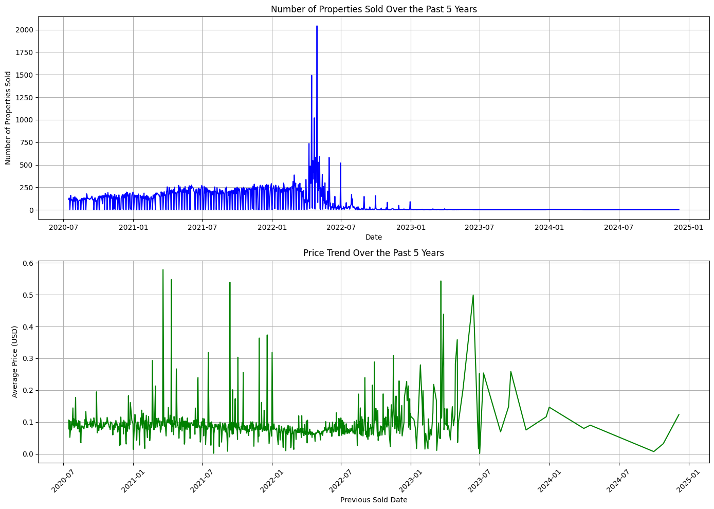
Key Dates in Property Market Trends
Over the past five years, the report highlights the days with highest and lowest number of properties sold, as well as the highest and lowest average sold price.
📈 Day with the highest number of property sales:
Date: 2022-04-29 | Number of Sales: 2042
📉 Day with the lowest number of property sales (excluding 0):
Date: 2020-07-18 | Number of Sales: 1
📈 Highest average sold price:
Date: 2021-03-20 | Average Price: $10,581,666.67
📉 Lowest average sold price:
Date: 2023-07-01 | Average Price: $15,000.00
🔷 Left Heatmap – Average Property Price by Season
This heatmap displays the mean property prices across the four seasons (Spring, Summer, Fall, and Winter) and two area types (Metropolitan and Micropolitan).
The color gradient helps identify where prices tend to be higher or lower.
Darker blue shades indicate higher average prices, while lighter shades represent lower prices.
This visual allows for quick comparison of seasonal pricing trends in different regional contexts.
🔶 Right Heatmap – Number of Property Sales by Season
This heatmap shows the total number of property sales for each season and region type.
The color map emphasizes sales volume, with deeper orange/red shades representing higher transaction counts.
It provides insights into seasonal demand patterns, revealing when buyers are more active in metropolitan vs. micropolitan areas.
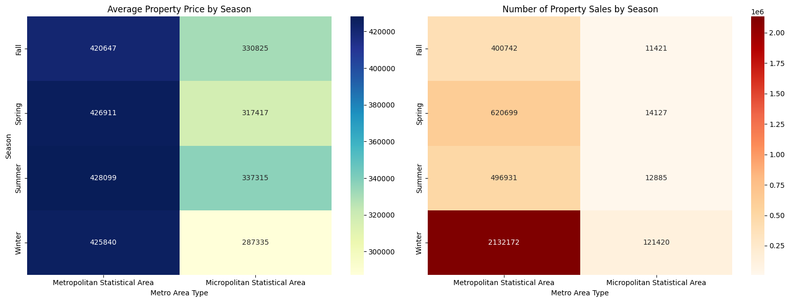
Interested Insight: Why Are Housing Sales Relatively Higher in Winter in the U.S.?
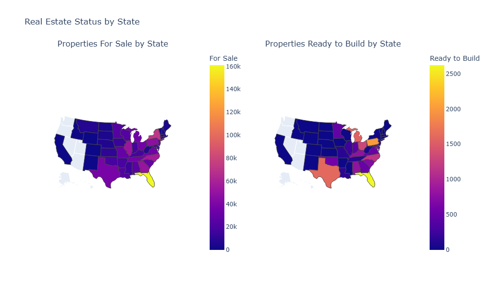
Left Map - Properties For Sale by State: The map highlights Florida (FL) as having the highest number of properties for sale, identified by a bright yellow shade. Several states in the eastern U.S., such as Illinois (IL), Georgia (GA), and North Carolina (NC), show relatively high numbers. Among them, New York (NY) stands out with a brighter violet shade, indicating a higher concentration—second only to Florida.
Right Map - Properties Ready to Build by State: The map highlights Florida as having the highest number of properties ready to build, indicated by a yellow shade. Notably, Texas (TX), with its wide area, shows a relatively high number, represented by an orange shade—similar to Michigan (MI). Additionally, Pennsylvania (PA) displays a brighter orange hue, suggesting a higher concentration compared to the other two.
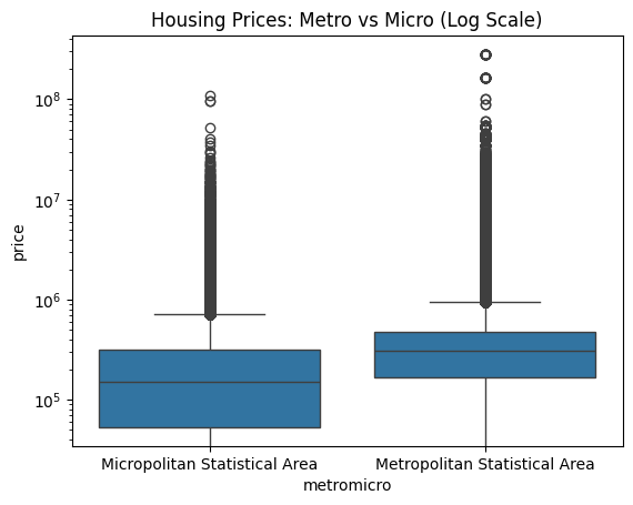
The violin plot shows the distribution of housing prices in Metropolitan (Metro) vs. Micropolitan (Micro) areas. Here's what the shapes and lines represent:
- Violin width: Represents the density of data points at different price levels (how concentrated the prices are).
- Box inside the violin: Shows the interquartile range (IQR), with the white dot indicating the median price.
- Whiskers (lines extending from the box): Indicate the range of prices (minimum to maximum or a percentile range).
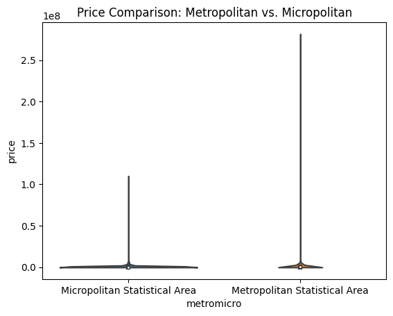
Summary:
- Micropolitan areas have housing prices concentrated around similar values with fewer extreme highs or lows.
- Metropolitan areas show a wider range of prices, reflecting a diverse housing market with both affordable and luxury homes.
This explains why the Micropolitan violin looks wider and shorter, while the Metropolitan violin is narrower with longer whiskers.
While Welch’s t-test shows a statistically significant difference in mean housing prices between Metropolitan and Micropolitan areas (p < 0.001), the effect size is small (Cohen’s d = 0.13). This suggests that although the difference is consistent across a large sample, the magnitude of the average price gap is modest relative to the overall price variability.
Using CBSA titles to identify the most popular (i.e., expensive) housing markets based on median home prices.
The top 10 CBSAs are ranked by their median property price.
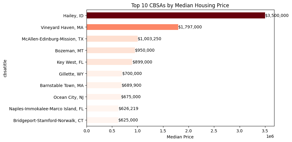
The analysis of average housing prices by CBSA shows that price differences are driven more by specific metropolitan areas than by broad metro vs micro classification. While the overall metro–micro effect is modest, certain CBSAs exhibit substantially higher average prices.
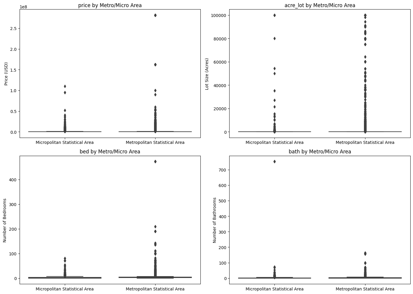
From the plot, we can see that property types in metropolitan areas are more diverse than in micropolitan areas, consistent with the findings in the price comparison. More price ranges are available, offering a wider variety of property types.
Interpretation:
The RMSE values indicate that XGBoost achieves significantly higher predictive accuracy than Random Forest on the test set.
Specifically, XGBoost's RMSE is approximately $46,684, whereas Random Forest's RMSE is around $70,683.
This difference suggests that XGBoost is better at capturing non-linear relationships and interactions between features such as zip code, lot size, and the number of bedrooms and bathrooms.
In contrast, Random Forest, while robust, is less sensitive to high-cardinality categorical features and the log-transformed target variable, resulting in higher prediction errors.
Model Performance Overview
|Model | Test RMSE (in dollars) |
|-----------------------|------------------------|
| XGBoost (F-score) | $46,683.78 |
| Random Forest (MDI) | $70,682.97 |
Given the highly right-skewed distribution of housing prices, with a median value of $275,000 and the presence of extreme outliers, model performance was evaluated relative to the median price rather than the mean. Under this benchmark, the XGBoost model achieved an RMSE of $46,683.78, corresponding to approximately 17% of the median home price. This represents a substantial improvement over the Random Forest model and indicates a reasonable and practically valuable level of predictive accuracy for typical residential properties.
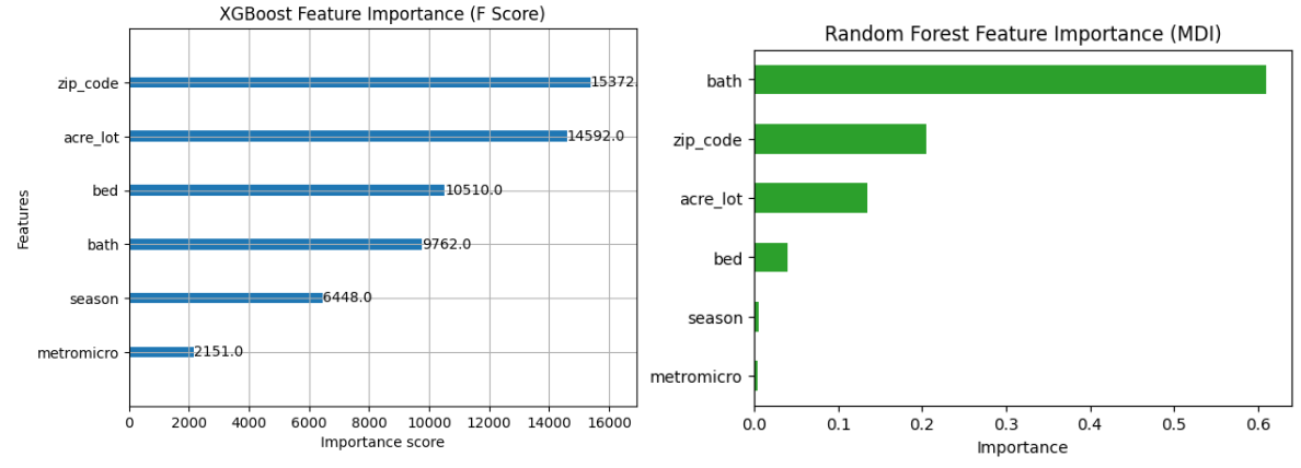
F-Score (also known as frequency) is the number of times a feature is used to split the data across all trees in the XGBoost model.
Interpretation:
- zip_code: 15372.0 → Used 15372 times.
- acre_lot: 14592.0 → This feature was used 14592 times to split nodes across all decision trees.
- bed: 10510.0 → Used 10510 times.
- bath: 9762.0 → Used 9762 times.
- season: 6448.0 → Used 6448 times.
- metromicro: 2151.0 → Used 2151 times.
Features with higher F scores contribute more significantly to the model’s decision-making.
MDI (Mean Decrease in Impurity) measures how much a feature contributes to reducing the prediction error across all trees in a Random Forest model.
Higher values indicate that the feature has a stronger impact on improving the model’s accuracy.
Interpretation:
- bath: 0.610 → Contributes 61% of the total reduction in impurity; most influential feature.
- zip_code: 0.206 → Contributes 20.6% of the total impurity reduction.
- acre_lot: 0.135 → Contributes 13.5%.
- bed: 0.040 → Contributes 4.0%.
- season: 0.006 → Contributes 0.6%.
- metromicro: 0.004 → Contributes 0.4%; least influential.
Key Point:
- Unlike F-score, which counts how often a feature is used to split, MDI reflects the actual contribution to improving predictions.
- Features with higher MDI values have more effect on reducing model error, even if they are used less frequently in tree splits.
XGBoost substantially outperforms Random Forest in terms of predictive accuracy, achieving a test RMSE of $46,684 compared to $70,683 for Random Forest.
Feature importance analysis reveals a clear methodological contrast: XGBoost’s F-score emphasizes frequently used split variables such as zip code, whereas Random Forest’s MDI highlights features that most effectively reduce prediction error, with the number of bathrooms dominating the importance ranking.
Despite these differences, both models consistently identify structural housing attributes—acreage, bedrooms, and bathrooms—as the primary drivers of housing prices, while temporal and regional classification variables play a secondary role.
This project analyzes and predicts U.S. housing prices through structured data processing, exploratory data analysis, and machine learning modeling. Data preparation ensured consistency and reliability, while visual and statistical analyses revealed key trends across time, geography, seasonality, and market types.
Comparisons between metropolitan and micropolitan areas highlighted significant price differences, supported by statistical testing. A one-year housing price prediction model was developed and evaluated using RMSE, demonstrating strong performance. Feature importance analysis from XGBoost and Random Forest models identified critical drivers of housing prices, providing insights into both market behavior and model interpretability.
Overall, this project showcases the value of data-driven approaches for understanding and forecasting real estate markets.
📌 Gradio (HF Space): USA Real Estate 🏠 Your personal US house price advisor
📌 GitHub: github.com/JYUN-YI/usa-real-estate
📌 Data Sources:
▫️Raw Data - Kaggle USA Real Estate Dataset, Zip Code CBSA Crosswalk 2015 (U.S. Census), OMB CBSA Reference File 2015.
▫️Processed Data - Hugging Face Dataset (jyunyilin/usa-real-estate)